
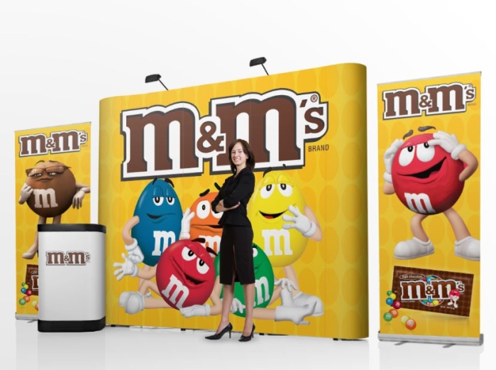
Banner stands make an important part of promotion items in any exhibition or trade show. Not just the exhibition, these are also the effective tool to impress passerby in the shop. An attractive and creatively designed banner stand can create a huge impact on the minds of the people and help you in your promotion.
Like any other marketing tool, it contributes to your brand promotion. That is the reason, you should give equal attention to banner stands, and hire a reliable and experienced company to craft compelling stands. It should be able to deliver your message effectively. All this is possible when you know right techniques to design banner stands. Check the tips given here to design attention-grabbing promotion items.
Keep logo at the top: The top of the stand grabs maximum attention and you should use it to display the logo and the company message. Whether it is the company tagline, slogan or an image, it should be at the eye level to draw the attention of people.
Keep left to right rule in the mind: Human tendency is to read from top to bottom and from left to right, so while designing the standing banner, keep these rules in mind. You should also try to offer maximum information in limited words so that the banner does not look messy. The ad banners are just to inform, not to pitch the customer. Providing detailed information is the responsibility of the sales team.
Color: Let color grab the attention of people towards your roll up stand. If you want to stand out from the crowd at any expo, you banner should have attractive colors. The colors you choose must go well with your brand, logo, and the industry. It includes all the colors: text color, image color, and the background color. The background and text color should have right contrast so that people can read it easily. For instance, yellow and white can be good colors to draw attention, but reading the text in this color combination is really hard. So refrain from using these colors together.
Images: If you want to use visuals on your banners, make sure these are high-quality images. The images you choose to use in the banners should be at least 300 dpi and saved as CMYK ready for print. Using an image direct from the web will spoil the quality of the image as well as the banner. Keep in the mind that the objective behind the image is to draw people’s attention not to drive them away. If you don’t have relevant images, you can also check varied websites, which offer royalty free images.
Contact details: This makes an essential part of the banner. At an exhibition, where you might not interact with every person, the contact details help people reach you even after the expo. The contact details can include your website, phone number and email address. The right place for the contact information is at the bottom of the stand banner. Just ensure that it is clear and easy to read.
A banner stand can really help you get more leads, but only when it has been designed strategically. Pay attention to every detail and hire an experienced company that knows how to design promotion banners for different industries.
